

Perfectly Balanced
Monochrome interiors are restful, timeless and practical. By restricting the colour palette, any number of eclectic elements can exist happily together, inexpensive or simple things look more sophisticated and decorating decisions are made easier. Creativity flourishes within the boundaries of black, white, grey and all the shades in between.
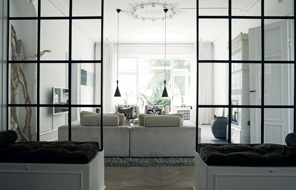 The style of this Danish home is delightfully plain and simultaneously sophisticated.
Monochromists seem to divide into two camps: those who err on the brighter side, preferring shades of white, light-flooded rooms, pale or bleached floors and a smattering of black for details; and others who would happily swap day for night, veering towards darker neutrals and unafraid of the liberal use of black, creating rooms that are enveloping retreats.
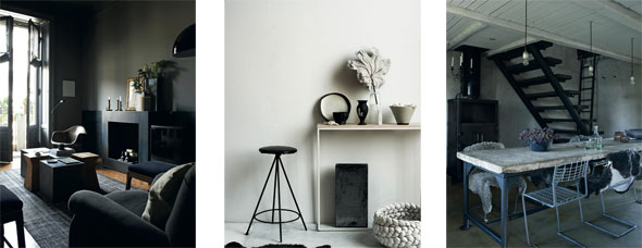 This 1920s apartment, owned by an Italian architect, is decorated in five shades of dark grey. Texture is all-important in this black-and-white interior, which relies on hard, soft, rough and smooth to add character to the monochrome scheme. Here the smooth floors are made from concrete and the walls plastered in a rough render similar in tone.
Both tribes understand how to shift the balance of light and dark, reserving black for a bedroom or white for a kitchen, where light keeps the mood energetic rather than soporific.
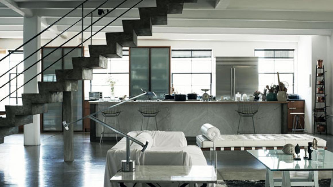
 The owners of the Brooklyn home above have added their personal stamp to the monochrome palette with industrial light fittings and a mix of wooden furniture.
Committing to a monochrome scheme might sound restrictive, but it affords considerable freedom to experiment with mixing pieces from different decades, adding pattern and texture. If it’s all neutral, it all works together. Those hours spent contemplating paint swatches are over.
Monochrome Home by Hilary Robertson, with photography by Pia Ulin, is published by Ryland Peters & Small, priced £25.
The style of this Danish home is delightfully plain and simultaneously sophisticated.Monochromists seem to divide into two camps: those who err on the brighter side, preferring shades of white, light-flooded rooms, pale or bleached floors and a smattering of black for details; and others who would happily swap day for night, veering towards darker neutrals and unafraid of the liberal use of black, creating rooms that are enveloping retreats.
This 1920s apartment, owned by an Italian architect, is decorated in five shades of dark grey. Texture is all-important in this black-and-white interior, which relies on hard, soft, rough and smooth to add character to the monochrome scheme. Here the smooth floors are made from concrete and the walls plastered in a rough render similar in tone.Both tribes understand how to shift the balance of light and dark, reserving black for a bedroom or white for a kitchen, where light keeps the mood energetic rather than soporific.
The owners of the Brooklyn home above have added their personal stamp to the monochrome palette with industrial light fittings and a mix of wooden furniture.Committing to a monochrome scheme might sound restrictive, but it affords considerable freedom to experiment with mixing pieces from different decades, adding pattern and texture. If it’s all neutral, it all works together. Those hours spent contemplating paint swatches are over.
Monochrome Home by Hilary Robertson, with photography by Pia Ulin, is published by Ryland Peters & Small, priced £25.